Note: we know this year has been hard for everyone involved, including administrators and teachers. This is meant to be purely comedic -- we love our yard signs, bright colors and all!
As second semester seniors, we’ve been robbed of most, if not all the fun parts of senior year. Fortunately, Westridge understands this and has decided to compensate for our mediocre past 6 months with a Westridge yard sign.
I don’t know how the rest of the population feels, but there’s something utterly embarrassing about jamming a Westridge yard sign into some dirt in front of your house. Not only do your neighbors not care that you go to Westridge and that you’re graduating this year, but they know that you had enough pride to advertise your high school status to the public.
That being said, Westridge admin and whoever orchestrated the yard signs, if you’re reading this, know that we appreciate you and your efforts. We have all become insanely materialistic as a result of quarantine, so receiving these yard signs has probably been the highlight of our year for most of us. Without further ado, let’s rate four brave senior’s signs.
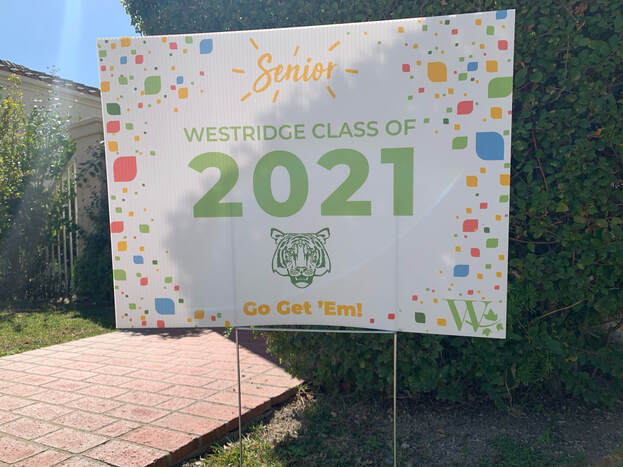
This sign is looking very chipper. It clearly has a can-do attitude. Discounting a couple of points however because it appears to be coming on a little too strong. I like my yard signs to have a little bit of mystery to them, more of a tall, dark, and handsome look. 8/10
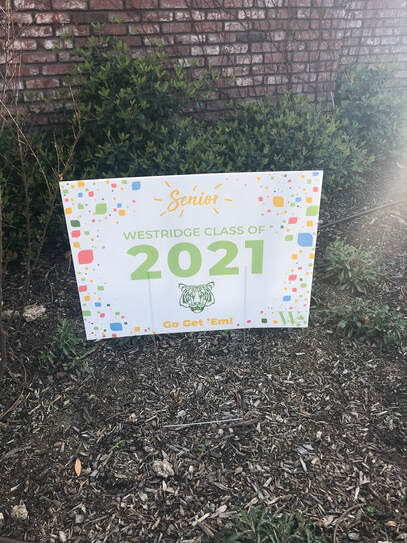
This sign’s bright color scheme gives it the lively energy of an infant’s bedroom. I almost sense a Canva template in the making. I like the use of three different fonts -- it adds depth and expression. 9/10 for creative palette and formatting, 5/10 for missing the mark on the age group.
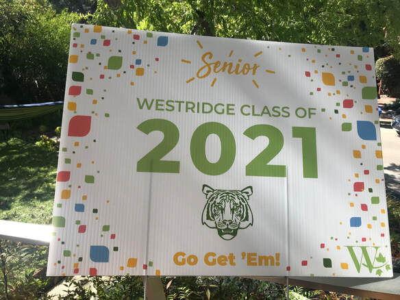
There’s a lot going on here. Nice bold font for the graduation year, and the tiger with the dead look in its eyes contrasts the lively green of the lettering quite nicely. The use of the Thursday Detention logo at the top worries me, though. Here at TD, we do not stand for plagiarism. 6/10
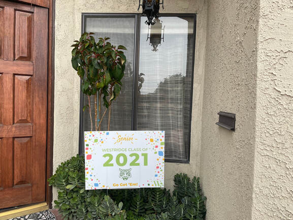
This sign looks like it came straight out of a Yogurtland commercial. I think it’s the shapes in the corners? 2/10